
Union Hotel
Chart Your Own Path
Strategy
Overview
Blue Door executed a complete rebrand of a Toronto boutique hotel, transforming it into Union Hotel: a culturally rooted, community-driven destination that celebrates individuality, local craft, and the spirit of gathering.
Silver Hotel Group engaged Blue Door to lead the full rebrand of their first Toronto property, a hotel operating since 1933 across from Union Station. Despite its history and location, the hotel lacked a coherent brand strategy and identity, positioning it as a generic, convenient option rather than a destination worth seeking out. Blue Door was responsible for every dimension of the rebrand: brand naming, brand strategy, visual identity, website, and marketing collateral. Through research and ideation, Blue Door identified that the target audience actively sought authenticity, novelty, and experiences that felt personal rather than standardized. The new brand strategy was rooted in locality, Toronto’s rich history, and the neighbourhood’s textile heritage. The hotel was renamed Union Hotel, a bold, hyper-local name that celebrated individuality, creativity, and the art of gathering, with collateral designed to encourage guests to chart their own path. Union Hotel championed small independent creators across design, vendors, and talent, including a partnership with a local industrial fashion designer for hotel uniforms and merchandise, and a dedicated web page and newsletter series to spotlight their contributions. The project delivered a fully realized brand identity and naming system, an experience-driven website, a comprehensive suite of marketing collateral, and a scalable framework for ongoing creator collaboration.
Scope of Work
Brand Naming
Led the naming process from ideation through validation, arriving at Union Hotel.
Brand Strategy
Developed a comprehensive brand strategy rooted in locality, independence, and the art of gathering, establishing a foundation for all creative and marketing decisions that followed.
Visual Identity
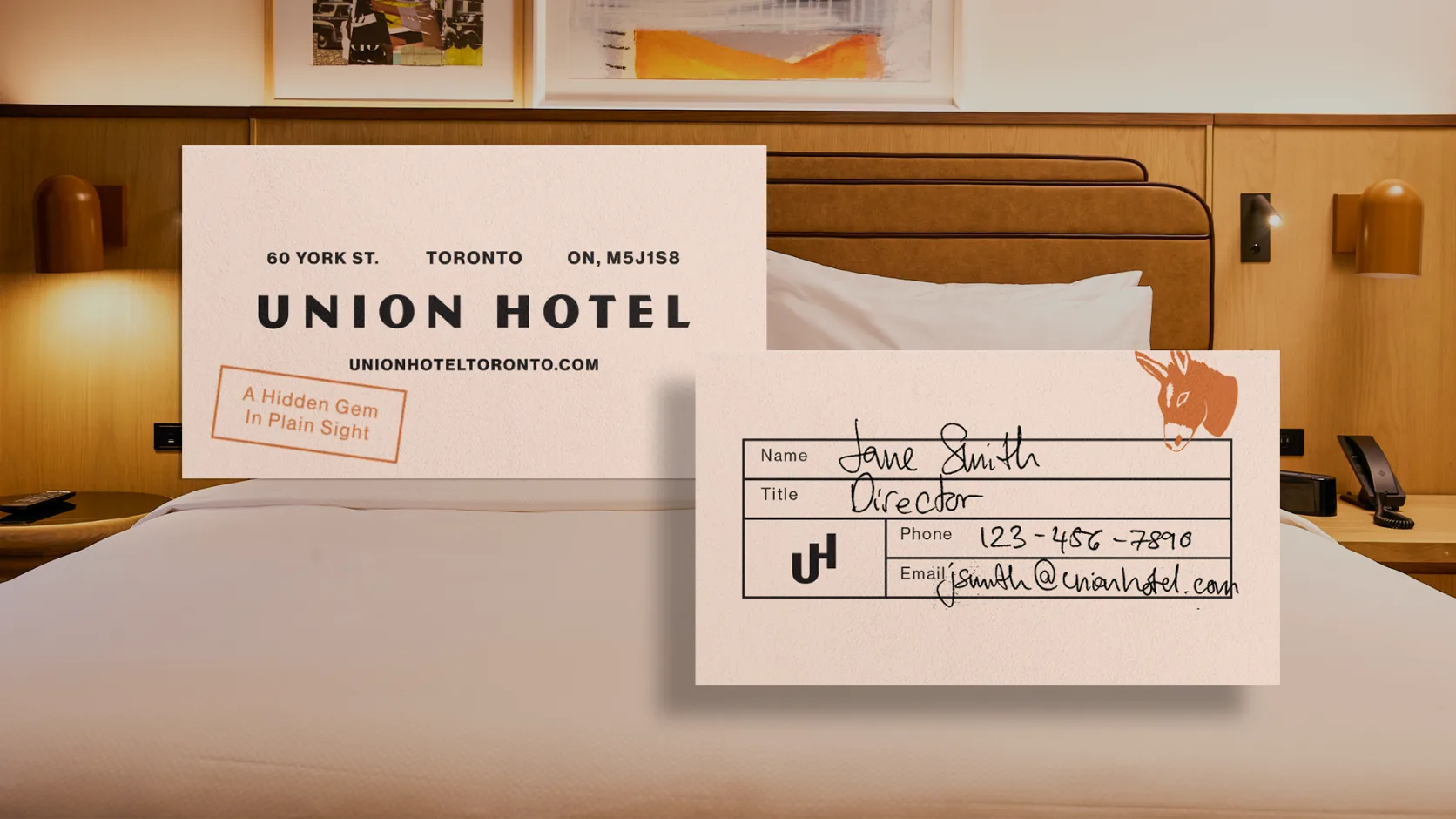
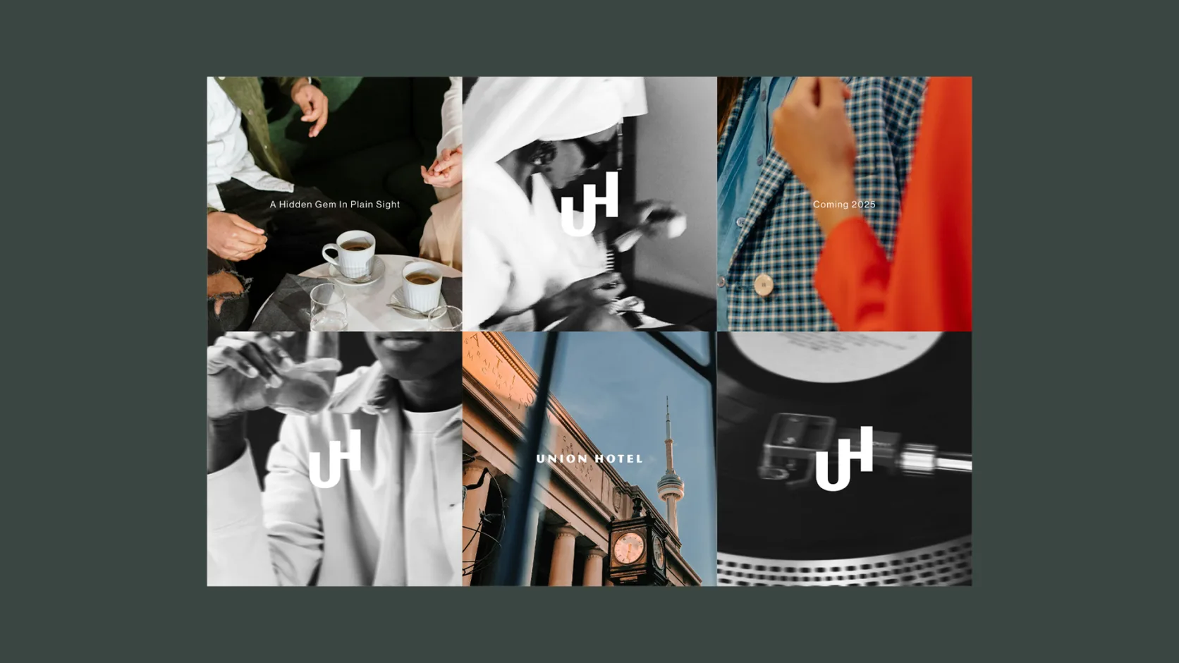
Created a distinctive visual identity system informed by the neighbourhood's textile heritage and Toronto's cultural history, designed to scale across touchpoints and support ongoing creator collaborations.
Website
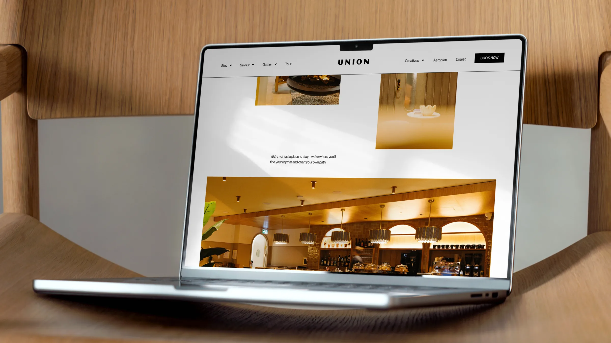
Designed and developed an experience-driven website that reflected the Union brand, showcased the hotel's community partnerships, and highlighted the local creators behind the guest experience.
Marketing Collateral
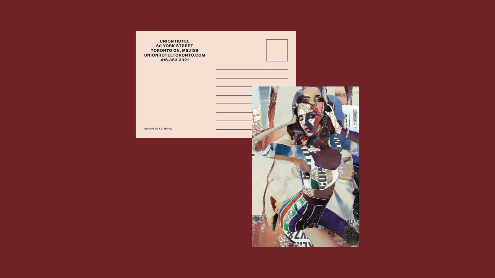
Produced a comprehensive suite of brand and marketing materials spanning print, digital, and environmental applications.

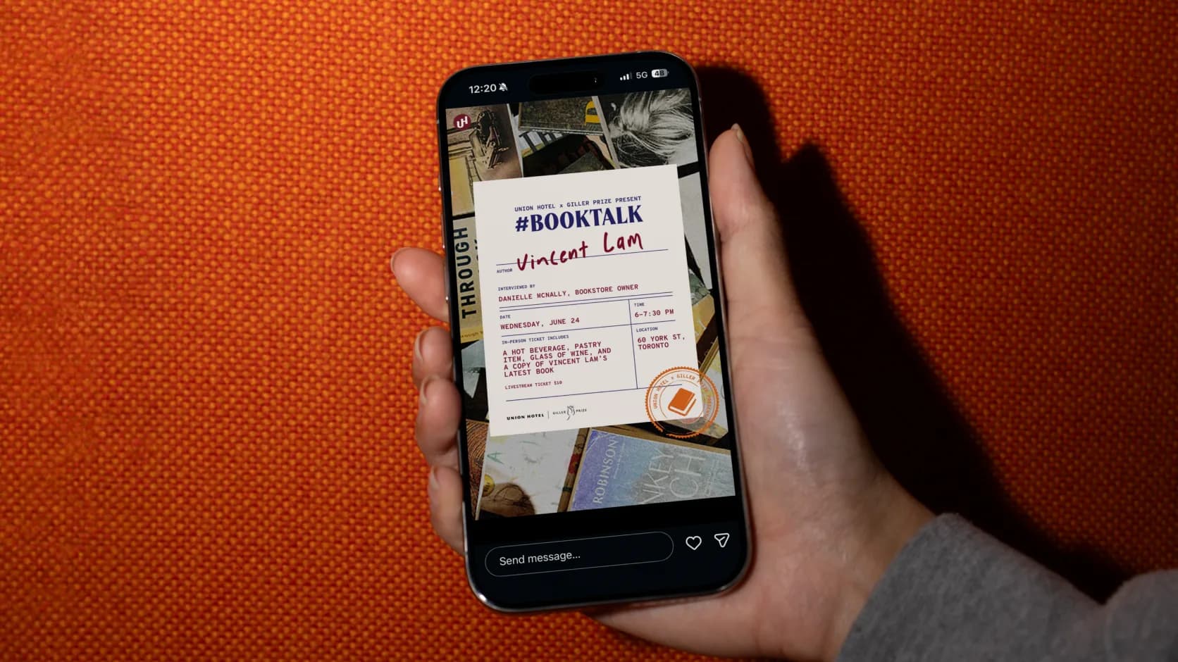
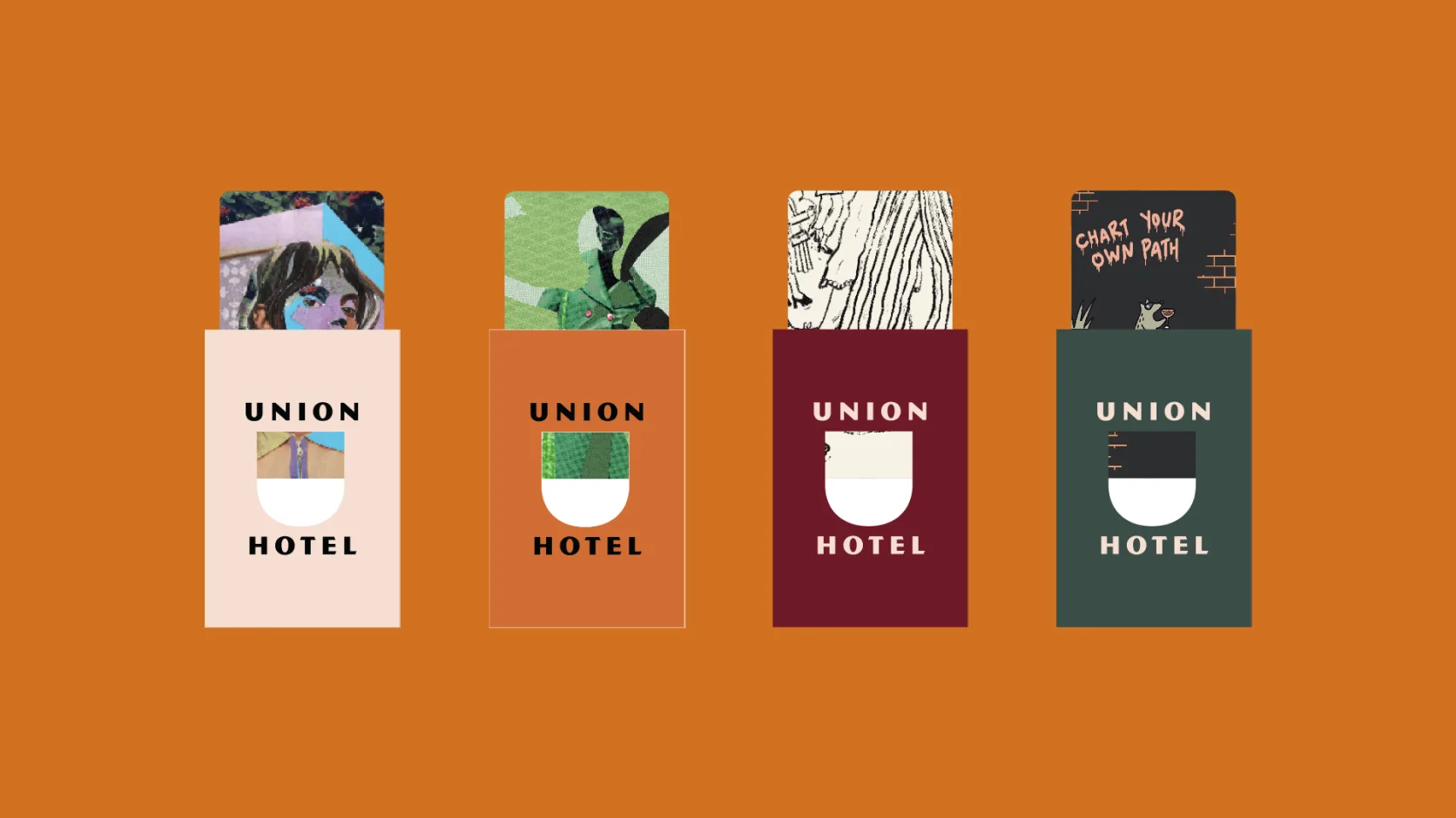

The Name That Owned the Location
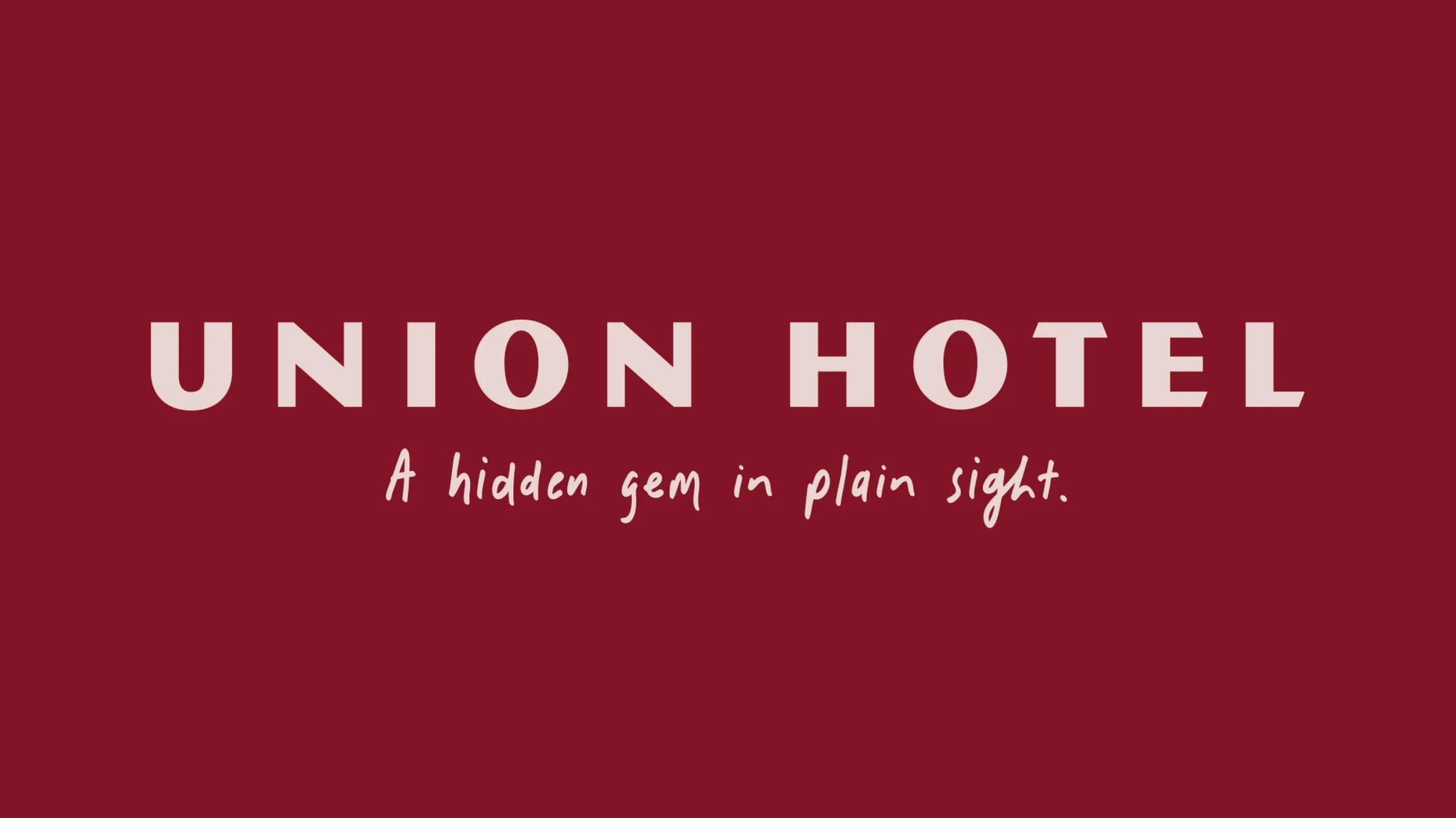
Naming a hotel after one of Toronto's most iconic transit hubs was a bold move that paid off immediately. It was hyper-local by design, Toronto-first in its procurement and partnerships, and built around the idea of unity: people gathering with a common purpose, each charting their own path.

A Visual Identity Built From the Ground Up
The Union Hotel identity was designed as a complete system, with every element rooted in the brand's strategic pillars. The primary wordmark uses Magnesium MBV Regular, a typeface that balances confidence with warmth, set in wide-spaced uppercase to command presence. Accent copy is set in Juniper Bay Regular, a script face that brings the brand's handwritten, human quality to life. The colour palette draws directly from the neighbourhood's textile heritage: warm, layered, and distinctly Toronto.

True North Awards Nomination: Hospitality Project of the Year
The nomination recognized a shared commitment across Blue Door and Silver Hotel Group to building experiences rooted in place, celebrating Canadian makers, local partnerships, and spaces that bring people together in meaningful ways. The nomination sat alongside Silver Hotel Group's nominations for Canadian Hospitality Ownership or Management and Uniquely Canadian Brand, validating the strategic foundation the rebrand was built on.